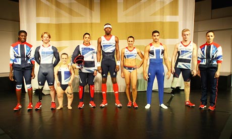
So the Stella McCartney designed Olympic kits have been unveiled today.
They have to be special, they have to be different, they have link to what GB&NI is all about. But most of all they have to be fit for purpose for the various athletes in their disciplines.
From what we have heard today by the various athletes and Stella herself that was the prime factor behind the design as far as shape, material and form of the various elements go. Discussions were held with the various sports about what was required as far as that was concerned. Some sports like swimming actually have regulations about what is allowed in terms of material.
So it comes down to design. Some people are complaining that Stella's design removed the red from the flag. But there is more red in her designs that in 2008 (right). Which was a very simplistic use of blue and white with red highlights.
However, athletics and cycling currently both use the Union flag in different ways in basing their current international colours. They do use the colours in all their correct details. So how could Stella incorporate flag without giving more of a hint to one sport than another. Simple, she went for a stylised monocolour, multitone version of it. Something that has been done before.
It brings an abstract yet recognisable version of our flag. But it is also something that stands out as special and different for all the sports men and women involved in both the Olympics and Paralympics. There is more red in the kit that there have been probably since the red and blue hoops around the midriff, that s before female runners did away with the midriff section of their kits.
I fell the kit will make a statement in these games. It will be something that ordinary sports fans will want to own a bit off, when replicas go on public sale next month. Therefore for a home games when the idea is for people to really get behind their athletes this is just the right thing to put out there for our team and our country.


No comments:
Post a Comment